No wonder, then, that CSS frameworks emerged over time and took most of the pain away. Today we can’t imagine coding without our favorite CSS framework, as targeting multiple screen sizes has become a necessity. But how do you know your framework is the best for the job at hand? Also, if you’re new to front-end development, which framework should help you pick? This post casts a sweeping glance at the front-end development landscape and compares the front-runners among CSS frameworks. So if you’re tired of hand-coding CSS rules, dive in for some quick relief!
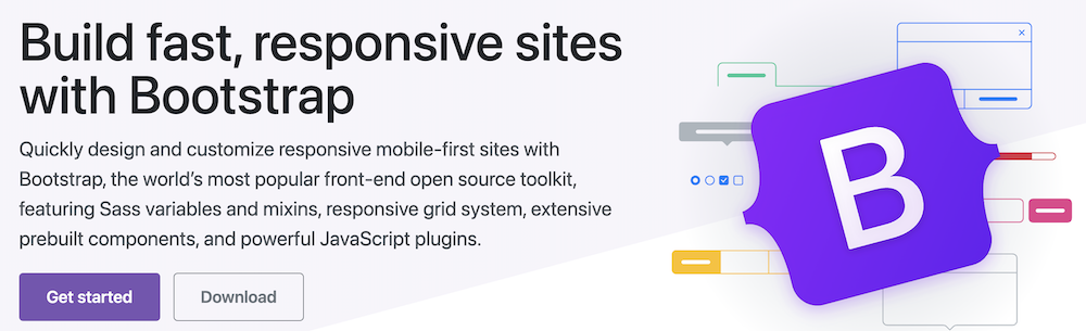
Bootstrap
An initiative by Twitter, Bootstrap takes credit for introducing responsive design on a large scale. It was the first framework to promote the philosophy of “mobile-first.” No longer was designing for smaller screen sizes a separate project in itself; all you needed to do was include the relevant Bootstrap classes, and the design would automatically adjust for different screen sizes (well, almost).
Responsive design in Bootstrap (4.0 vs. 3.0)
Bootstrap achieved responsive design by introducing the idea of a grid. A grid is an invisible partition of the screen into columns (along with the width). For example, if you have three “boxes” you want to position side by side on large screens, but vertically on smaller screens, this is what you’d do: The current popular version of Bootstrap is 4, which was a major overhaul over the 3.3 series. The above syntax is how you’d code in Bootstrap 4, which owes a lot of its elegance to the raw power of Flexbox and other modern layout features supported by browsers directly. In the lower versions of Bootstrap, the grid was defined as a total of 12 columns, which resulted in code such as to make a div take up one-third of the screen width on large-size devices, and half the width in medium-size devices. The syntax now is a lot more pleasant, though it demands familiarity with Flexbox.
Bootstrap Pros
There’s much to like about Bootstrap, especially for full-stack developers:
Rapid prototyping: With Bootstrap, there’s almost no need to spend thought on tricky CSS positioning and browser incompatibilities. All you need to do write out the HTML, and then applying the appropriate CSS classes causes the responsiveness to come alive.Large ecosystem: As of today, Bootstrap has the largest ecosystem among front-end frameworks. The number of website layouts, themes, admin panels, UI components, etc., built using Bootstrap is mind-boggling, and it keeps getting better. For consultants and product companies alike, this means pre-built items and community support will always be plenty.Backed by Twitter: An emerging trend in open source is the rise of projects sponsored by a commercial entity. More often than not, these entities build profitable businesses around their offering. Kotlin (JetBrains), WordPress (Automattic, Inc.), Angular (Google), React (Facebook), etc., are some examples. When a project is backed by an established entity and is not a one-person show, it gives faith to the community (especially the enterprise customers) that the project will have a clear roadmap and long-term future.A large collection of components: Bootstrap offers, out of the box, almost all the UI components you’re ever likely to need. Navigation, forms, cards, modals, buttons, badges, progress bars, alerts . . . You name it, and Bootstrap has it. For many companies, this practically cuts down the need to have a dedicated front-end team.LESS and SASS support: Among the massively popular CSS frameworks, Bootstrap is the only one that supports both LESS and SASS. Yes, I know, you don’t use LESS (as no self-respecting developer should, right?), but hey, there are massive projects out there that rely on LESS. Of course, you can choose neither and write out your plain CSS files.
Bootstrap Cons
Nothing is without a price, eh? Well, Bootstrap is no exception. Over time, Bootstrap has come under heavy fire by designers and UI experts. Here’s why:
UX monotony: The very fact that Bootstrap has such a large collection of built-ins results in websites that look all-too-familiar, and quite honestly, dull. You only need to head over to the official examples to see just how much of an eyesore the defaults are. Just search for “all bootstrap websites look the same,” and you’ll know what I mean. 🙂Styling woes: Bootstrap is what might be considered an opinionated framework. In other words, it has ideas about layouts, and it makes you work extra hard if you want it to look/behave differently. Consider the default CSS breakpoints for screen widths: a medium-sized screen for Bootstrap is one that starts at a device width of 768px. And what if you want to target, say, the limit of 600px? Well, good luck with that! It’s the same with almost every other component in bootstrap: rows and containers have their default padding, buttons have colors and borders that are very tricky to override without a lot of work, and so on.
Want to master CSS? Check out this Udemy online course.
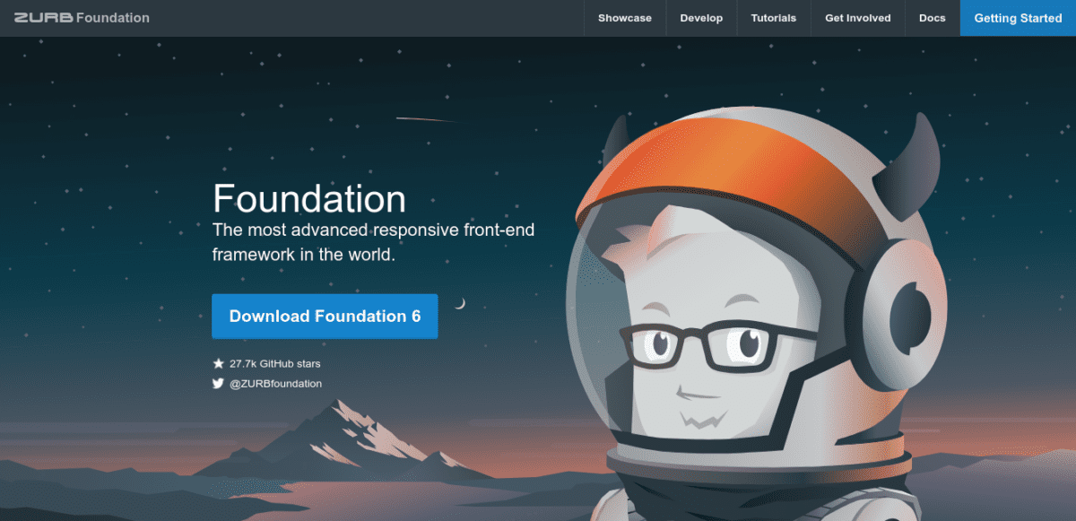
Foundation
If technologies were religions, the Foundation and Bootstrap guys would be out for each other’s blood. No discussion of modern CSS frameworks is complete without mentioning Foundation, so here we go. Head over to the Foundation website, and you can’t help but notice the byline: “The most advanced responsive front-end framework in the world.” At first glance, it looks like a tall claim to go with a marketing campaign. However, adherents of the Foundation framework know there’s at least some truth to that. Foundation was developed to go naturally with the Rails framework, and several of the Rails’ “zen-like” guiding principles can be seen at work. For instance, if you wanted a row that contained two elements on small screens, three on medium, and four on large ones, the equivalent code in Foundation will look like this: As compared to earlier Bootstrap versions, I find this very intuitive and easy to memorize. No more twelve column grids and figuring out what 4/12 is supposed to be! While Foundation is much less popular than Bootstrap, it’s a trade secret for many expert front-end developers.
Pros of the Foundation Framework
Foundation has some unusual characteristics out of all the CSS frameworks we are going to consider in this article:
Full tooling: It’s technically wrong to say that Foundation is a CSS framework. I mean, it is, but it’s been built as a large and modular collection of tools that aims to solve almost all kinds of front-end problems. There are separate framework offerings for websites and emails, heavily optimized for their respective domains. Foundation also comes with a command-line interface (CLI), which will sound like music to the ears of developers used to working with Webpack or other module bundlers.Extreme flexibility: Unlike Bootstrap, Foundation was built to give the front-end developer full control over their UIs. As a result, Foundation will feel bland and enormously complex to the newcomer. However, the reason is that Foundation doesn’t force any style language on you, but aims to be just what it is: an excellent CSS framework.More than just UI components: While Foundation has the usual collection of UI elements, it goes much beyond the call of duty. The developers have included an advanced responsive image system, a pricing table component (yes, the one used to show various pricing plans), form-validation, right-to-left support, responsive embeds, and more. I’d like to emphasize again that this is an overkill for most simple websites, but for large ones, it’s a boon the experienced developers will recognize.Training and consulting: Now, while Bootstrap is created by Twitter, it’s a side project and a very small part of the overall picture. The company behind Foundation (ZURB), however, is committed to using, developing and promoting it. Training courses and professional consulting are offered for large customers, which is great for companies that are targeting massive projects and are willing to pay.
Cons of the Foundation Framework
The strengths of one framework become its weaknesses when viewed from the opposite point of view. Here’s why the Foundation may not be the best choice for your project:
Small(er) community: The Foundation community is much smaller than that of Bootstrap, and if you’re trying something exotic and get stuck, the chances of finding relevant help are lower. However, I would add that for all practical purposes; there’s enough of a community out there. It’s just that it’s several orders of magnitude smaller than Bootstrap’s, so you might not find solutions instantly.Complexity: If you’re used to Bootstrap or something simple, or worse, to vanilla CSS, Foundation will feel like an infinite explosion of complexity. Layers within layers, components with components, endless customization options . . . Pretty soon you’ll begin to question the usefulness of life itself! But then again, Foundation has a very different aim and can’t be blamed for that.Too many options: Sometimes you just want to get shit done and worry about perfection later. During such times, it’s frustrating to be presented with too many options with minor variations. For example, think of having to order a Subway sandwich when you’re so hungry painstakingly you could eat mud. Naturally, Foundation isn’t for times like that.Talent availability: Since Foundation is (much) less popular than Bootstrap, the available talent is much less. As a general rule, any new hire is almost likely to know Bootstrap but won’t have a clue about Foundation. Learning takes time, and it’s a luxury not all teams can have.
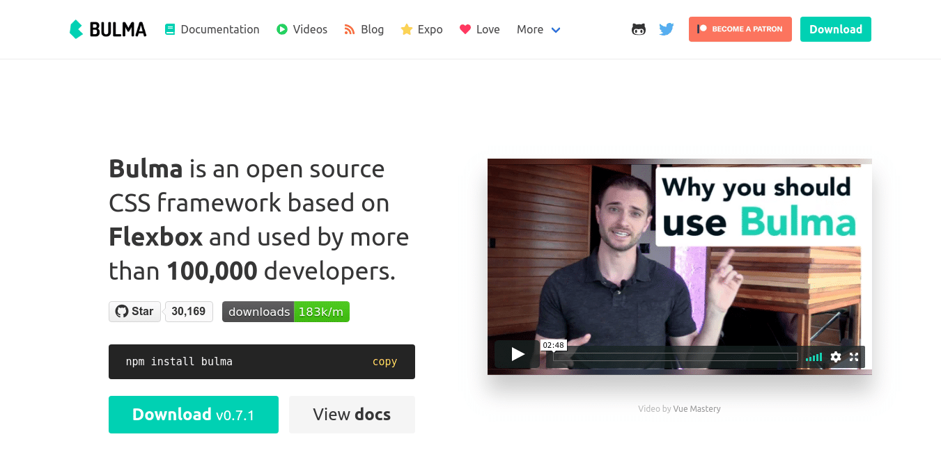
Bulma
Bulma is a relatively new entrant to the battleground of CSS frameworks and has made a name for itself in a short time. Its attractiveness lies in a strict, CSS-only approach (there are no JavaScript components), and elegant defaults, which is something many developers with a good eye for design have a problem with when working with Bootstrap. Much of the momentum of Bulma comes from high rates of adoption with the Laravel (a PHP web framework, in case you didn’t know) community, which I’m sure is pretty much what helped Vue.js rise to the heights of popularity among JavaScript frameworks.
Why choose the Bulma CSS Framework
There are many reasons to like Bulma and use it for your next project:
Quite popular: Okay, it’s not more popular than Bootstrap, but it is more popular than Foundation. As of writing, Bulma has 30k+ stars on Github, around 3k+ more than Foundations. Of course, a number of Github stars is no metric of merit, but it does say that the community approves of Bulma.Extremely readable classes: Bulma, for me, has the most readable CSS classes of all the frameworks I’ve tried. There’s also a ridiculously powerful and simple system for creating Metro-style grids, called tiles (just look at the code in the second-half of the screenshot, and tell me you’re not impressed!).
Flat learning curve: Bulma is highly modular and was created to solve the practical, everyday problems that smaller teams and individual developers come across. You’ll find that Bulma is very easy to learn, though I think that a decent background in CSS is always good to have an idea of what might be going on under the hood. This will help you when you want to override the default behavior.Elegant: Well, take a look at the default Hero section for Bulma below. Enough said!
Bulma has a small, but an extremely passionate community, so if you want to do away with all the fluff and yet want to come up with elegant-looking UIs in record time, Bulma is the way to go. For Bootstrap developers, Bulma has a separate section to convince and help them migrate over.
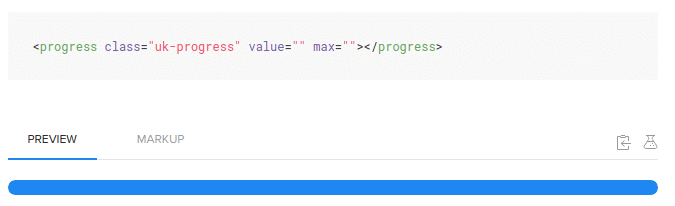
UIkit
The thing that comes to mind when thinking of UIkit is minimalism. Minimalism not in features (in fact, it offers perhaps the most features of all frameworks), but in design. If super-clean, elegant, non-whitespace-shy designs are your thing, UIkit has you covered. For instance, take a look at the progress-bar component: Or the image marker component (a JS-driven interactive marker for images): Or even the humble HTML form: If this doesn’t scream elegance at the top of its lungs, I don’t know what does. Just head over to the UIkit website and check out all the incredible components it has on offer. Unless your project manager or customer forces a particular style language on you, I think Uikit takes the crown for UI design and is several miles ahead of Google’s Material Design. But is there a catch, you’re wondering. Yes, there is. Like Bootstrap, UIkit works with its JavaScript and while you can use jQuery for DOM manipulation, using a virtual DOM framework like React is impossible. Also, Uikit is a self-contained system, and you won’t be able to modify or extend it without putting in considerable effort.
Semantic UI
Another contender in the race is Semantic UI, which tries to distinguish itself with a lot of themes and customization. There are more than 3000 theming variables, which results in a massive breadth. Or so the docs say. Bootstrap 4 kind of covers all this and is fully customizable as well, but one advantage with Semantic UI is that it results in nice-looking layouts by default. Still, it’s not the best-looking out of the box, which is why I put it later down on my list. It also has one of the steepest learning curves, and coding conventions are much more strict. Try it; I’d say, and see if it looks like something you might prefer.
Susy
Susy is a little-known framework at this point, but it’s a fascinating and refreshing idea. Another pure-layout framework, Susy does away with all predefined ideas of float, grid, Flexbox, tables, or anything else, and lets you compose the kind of layout you want. “Compose” is the keyword here, as Susy is meant for creating highly modular, staggering layouts with ultra-complex, unusual, and precise needs. In the hands of the expert developer, Susy is like a flamethrower than blows everything else away. Lesser mortals, of course, will manage to burn their hands. To get an idea of the power of Susy, sample this default setting (SASS): I think that the code is pretty self-explanatory, though it’s not for those in a hurry. 🙂 Susy makes perfect sense if you’re tired of all the bloat that modern frameworks impose on you, and you have layout needs that you know no ordinary framework can serve.
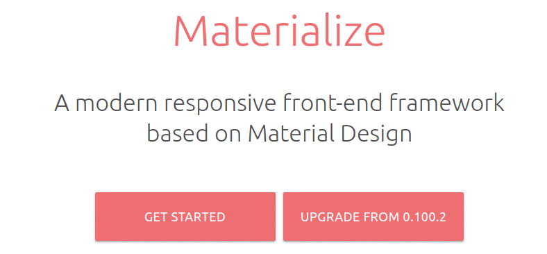
Materialize
If you’re in love with Google’s Material Design, Materialize is a framework you’ll enjoy. The best thing is that it has only a handful of components and classes to learn, and is focused on getting you productive as fast as possible. There are few customization options, and Materialize follows the popular 12-column grid format established by Bootstrap. If you ask me, though, a Material design is becoming so common, and is so . . . Flat by default, that pretty soon we’ll be complaining about it as we do about Bootstrap’s all-websites-look-the-same problem. Still, it’s a nice framework to start with.
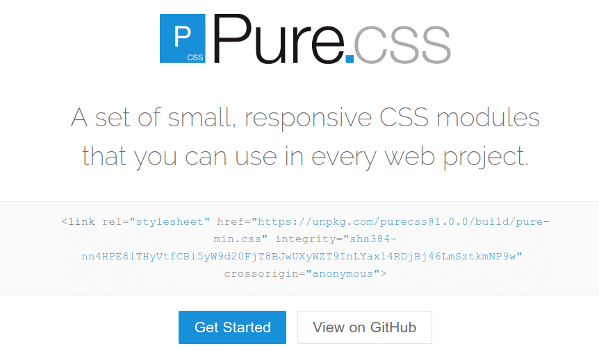
Pure
Is Yahoo dead? No, this question is not a diversion, but highlights an important observation: Yahoo built the Pure framework and released it under the BSD license. A quick look impresses me, and I wonder why this offering is not known to more people. Anyway, what makes Pure, well, pure, is that it’s a pure CSS framework. 🙂 In fact, the developers have gone the extra mile and broken it up into different CSS modules that you can import as needed. So, if you need only the grid system, there’s no need to import the entire CSS and add it to the site’s load time. The Pure grid comes in several flavors: 5-point, 2-point, 24-point, etc., so when it comes to creating columns, you have a lot more flexibility. Pure isn’t the best-looking CSS framework by default, but I can see how it adds value to those who want to solve a tiny CSS problem in their UI and cringe at the “helpful” defaults other frameworks come with.
Skeleton
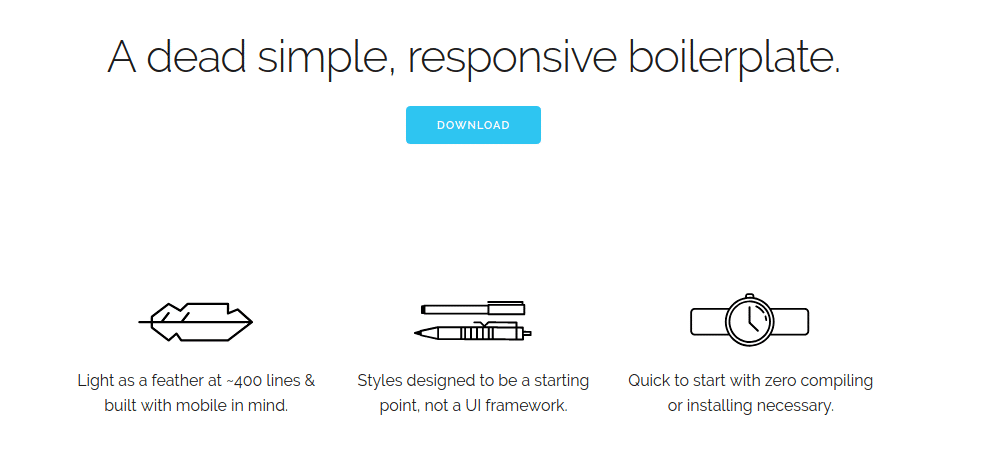
As you can see in the screenshot, Skeleton is so minimal that it doesn’t even call itself a CSS framework, library, or even module. It’s boilerplate, and contains only 400 lines of source code! Incredible? I think so, but to put things in perspective, Skeleton was designed for tiny or small projects that need little more than layouts and positioning. Worth a look; after all, who knows, Skeleton might be what you were looking for all along!
Milligram
Milligram, a CSS framework designed for speed and productivity. The developers have kept it under 2 KB in size, which by today’s standards, means a lot. A milligram is a fun little take on CSS frameworks that you’ll appreciate working with. Extending it is easy, and with a few lines of custom CSS, you can change its look to the way you want.
Tailwind CSS
I remember the early days when Tailwind CSS was released. It barely made a soft thud, and the ecosystem gave it no attention; and rightly so, given that Tailwind was neither backed by a tech giant nor had the push of a massive marketing budget. Besides, with Tailwind, you didn’t get a Bootstrap-like experience, something that had (or maybe still is) become the norm. In fact, Tailwind advocated a style of writing and using CSS that sent many screaming in disgust. I mean, look at the use of CSS classes in the following piece of code (taken from the Tailwind website): Now, if you’ve been a developer for more than a couple of years, you’d likely feel nausea. So . . . many . . . classes . . . ! And while there’s no inline CSS here, it feels like that given how explicit (and ugly?) the class names are. So, for quite some time, Adam Wathan (the creator of Tailwind) was running from pillar to post (that is, in podcasts, conferences, blog posts, tweets) about why he thought utility-based CSS was superior to semantic CSS. Nobody listened. (For those struggling with the terminology, here’s a quick explanation: a name based on utility would reveal its CSS “capability” right away; for example, “vw-100” would be correctly read by most as “viewport width – 100%” even without any additional info. Semantic CSS, on the other hand, advocates the use of class names that make sense from a business/context perspective; examples are: “reviews-list”, “review-image”, etc. The latter example is likely from an aggregator site where customers can post reviews, but it’s impossible to know what these classes actually do unless you look at the source code.) So, as I was saying, there was little to no impact made by Tailwind. But here and there, one by one, developers started liking and adopting the approach. I might be wrong, but I’d say somewhere in 2019, Tailwind exploded in popularity. It brought to Web development an unconventional approach and attention to some nifty tooling such as PurgeCSS. Today, utility-based CSS has made a sizeable dent. Look at this Bootstrap 5 code and see how prevalent utility classes have become: Having talked about the “big picture” of Tailwind, let’s turn to the concrete benefits it offers:
More productivity: Now, productivity is something we can argue about all day and never reach anywhere; that said, developers who have adopted Tailwind exclusively (especially for large projects) do say that they are much more productive. But you’ll need to invest sustained effort upfront because Tailwind will work for you only when you’ve unlearned “best practices” from the past.Smaller bundle-size: Tailwind is more or less JS manipulating CSS, so some elegant things are possible. For example, when you build the project, the compiler can strip away all the unnecessary CSS. This is quite a contrast to a typical web project using the Bootstrap CSS module; in this case, the entire Bootstrap CSS gets packed into the final thing.Configurable and Customizable: Tailwind is not just extremely modular but is built to highlight its ease of configuration and customization. There’s nothing like “getting started with Tailwind in 2 minutes” because you need to learn the what, the where, the why, and then some; another example: if you don’t have your design system ready and you don’t like the defaults, you’ll experience frustration. You have to go through the initial learning/adjusting curve before you can say “wow!”.No naming or context-switching: One of the biggest chores developers have is naming things. Should the final result be called totalAmountForUnits or expensesAcrossUnits, for example. The problem is even more serious in CSS as there can be hundreds (or even thousands) of classes in a project. Another problem is context-switching: jumping between your HTML and CSS constantly to see the CSS change. With Tailwind, the naming decisions are already taken for you, and since you’re always just adding/removing classes from HTML, there’s zero context-switching.Code reuse: If you find yourself “reusing” some useful classes by copy-pasting them across projects, Tailwind has a feature called Components to solve this problem elegantly. Read more about this feature here.
For many, Tailwind has been a breath of fresh air they desperately needed. If you are tired of your current CSS library and want to try something radical and new, Tailwind is what you’re looking for!
Tacit
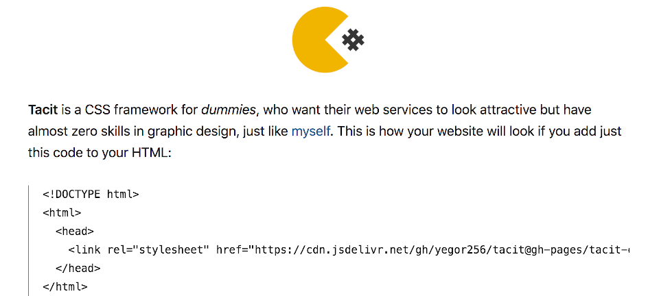
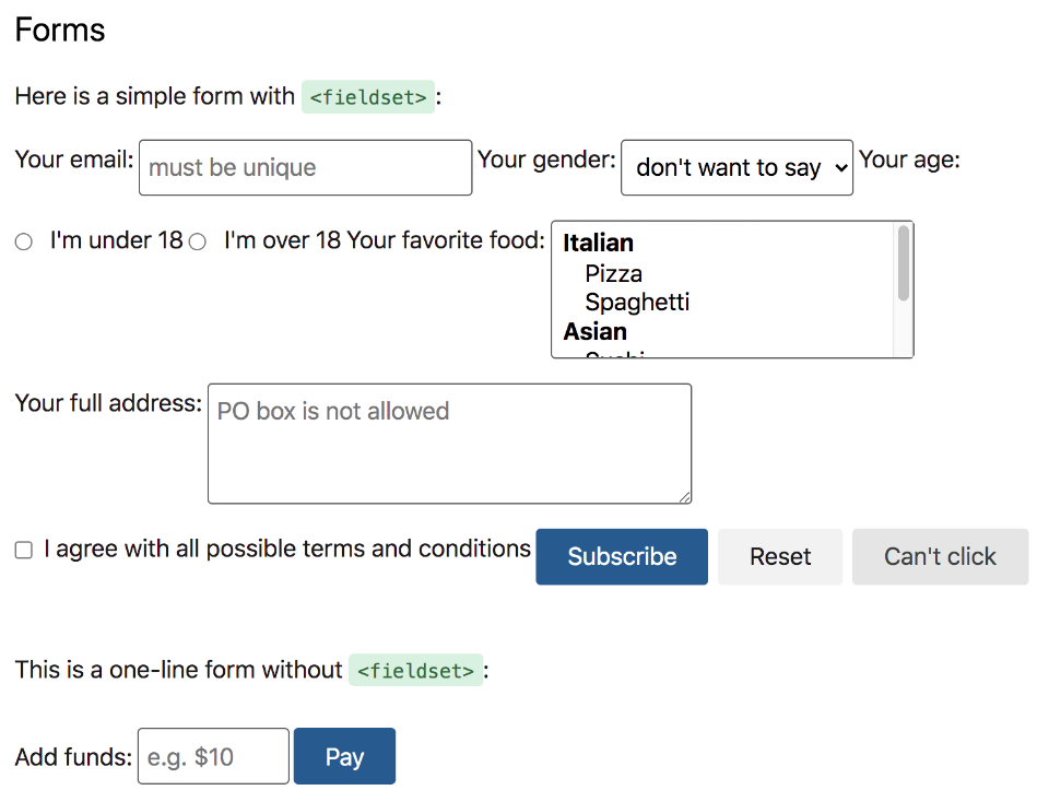
Tacit is somebody’s side-project that I came across while looking for interesting things for this article. Yup, simply a side project; nothing more than one person’s work based on their liking. Why do I stress that so much? Because this generally means the risk of getting abandoned is very high. But then, I can also think of a couple of positives: 1) The project is on GitHub, and so, if you’re a developer and want to support/expand Tacit, you know what to do. 😉 2) CSS is not like JavaScript in terms of change or evolution; whatever styling you’re using today will be supported by browsers for a very long time. So, what exactly is this Tacit thing? As the screenshot says, Tacit is for those who don’t know CSS or have bad taste in design. The idea is novel: add the CSS link to your project, and you’ll have a great-looking website instantly! But make sure you keep your promise: don’t ever add other CSS or mix stuff from other frameworks, as this will break things badly. And does a Tacit website look good? If you want to take my word for it, I’d say the design style chosen is “very good”. Actually, I find it even more pleasant than Semantic UI, one of the most popular CSS frameworks/libraries out there! Without getting into a flame war and making side-by-side screenshot comparisons, I’ll drop the subject by saying that design is subjective. But you can compare and decide for yourself. 🤪 In any case, let me add a couple of screenshots from Tacit’s look-and-feel. First, this is what form elements look like: And this is what tables look like in their most basic form: I’ll close out by repeating the obvious: if you think this type of colors, fonts, styles, etc., are great as defaults, Tacit will prove to be a welcome relief.
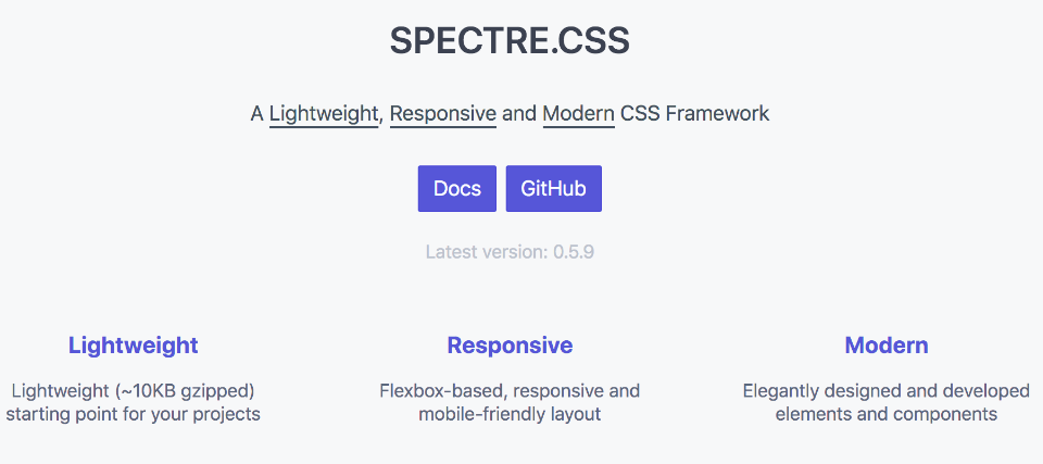
Spectre
Modern, flexible, lightweight — if you’re looking for something with these attributes, Spectre is worth a look. Let me explain my choice of adjectives for Spectre:
Modern: The layout system of Spectre is based on Flexbox, which is among the best things modern CSS has given us. Simultaneously, lots of facilities and tooling found in modern CSS workflows or other frameworks are also included.Flexible: You can write the most modular and advanced CSS framework, but it’s little use if it’s not easily customizable. I like how customization is mentioned at the very top of their docs; follow the rabbit hole, and you’ll find extensive explanations.Lightweight: We are in an era where concerns about web performance are on an upswing; every kilobyte being transferred is scrutinized and criticized. As such, Spectre wraps up everything in a sweet 10KB package, which should not be “too much” for all of us. 😝
Being lightweight doesn’t mean Spectre sacrifices functionality; there’s everything that you’re used to as a Bootstrap fan: components (accordions, breadcrumbs, cards, and more), elements (forms, tables, buttons, etc.), layout (grids, hero section, navbar, etc.), utilities (loaders, spinners, etc.), and more. What do I think about Spectre? I’m more or less sold, but there are a couple of things I want to mention. First, I’m not fond of the default primary blue color that much, so changing it is the first thing I’d do in my projects. 😬 Second, in 2020, I think the CSS Grid is the best tool for layouts; I find Flexbox a bit odd to do all the layout things, so I wish Spectre had used Grid instead of Flexbox. But this is hardly a deal-breaker if I’m able to develop fast and get good results. So, I’ll say go ahead and try Spectre fearlessly!
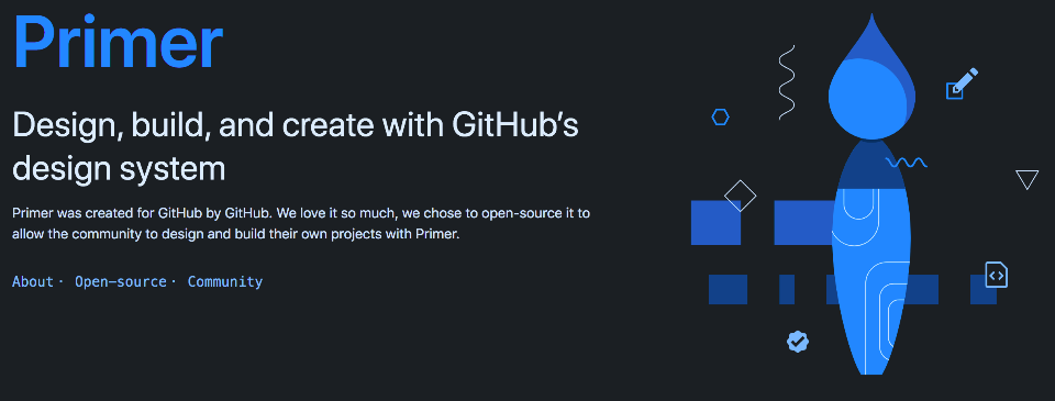
Primer
Primer is not a CSS framework or library. It’s not even a collection of CSS classes or some other weird twist on terminology. Then why is it on this list? Two reasons:
It has a CSS framework.It’s one of the most all-encompassing and mind-blowing things you’ll ever see.
Yes, as the screenshot says, Primer is a design system developed by GitHub for their own use. Eventually, they realized this thing was powerful and extremely useful for frontend and visual work; so, they made it open source. I’ve been struggling to find the right words to describe Primer. Their own Design System Team calls it . . . well, yes, a design system, but I think the scope is far broader than what we mean when we say “design system”. Primer includes many things, the importance of which may not be immediately obvious. At least to backend/full-stack developers. So let’s look at what these special things are why these are special:
Interface Guidelines: In a one-person team, designing and maintaining UIs is trivial. But add three more people to the team — and skilled, successful people at that — and you get to see how everything starts degrading. The reason is a lack of guidelines that are clearly defined and strictly enforced — so that everyone knows what to do in every type of situation. Primer comes with a nice set of guidelines that you can lift or adapt to your needs.Figma components: Even though I’m a developer, I know enough about design to understand that not having a clear component reference/usage can spiral out of control as the project advances. What should the button look like when it’s pressed in dark mode, for example? If nobody has this documented, and there is pressure to deliver, you’ll have several variations. And so, the folks at Primer have provided their own Figma files so that we can learn and do better.CSS Framework: Finally, the thing that earned Primer a place on this list! 😄 Primer has a modular, BEM-style CSS framework that provides separate styles for the product and marketing pages. This is something GitHub did for their convenience, and you’re free not to touch it or accept the overall philosophy the way it is. Even if it’s just the CSS that interests you, I recommend you have a look here.Icons (Octicons): Every coherent design system has its own take on icons. For Primer, the answer is Octicons. There aren’t that too many icons, apparently. Still, I’m putting this higher on the list because icons are part of the absolute fundamentals: if everything matches but a few icons don’t, the result is a UI that gives you conjunctivitis. 😝React components: And of course, since React is the most popular frontend library, the GitHub folks coded the CSS elements as React components, which are now available for all of us!Presentations: This part of Primer is all about what design language to use when presenting to audiences (as used by folks at GitHub internally). Fonts, colors, borders, contrasts — all the decisions have been taken already. You’re free to study their guidelines and develop yours.
The biggest benefit of Primer comes from embracing it as a whole. This might not be possible for everybody, and some may even find that their design language conflicts with GitHub’s. And then, some people find one particular part (or even a part of the part!) of Primer useful and run with it. No matter where you stand on this spectrum, Primer has something to offer you: either reusable, high-quality design system components or food-for-thought for your own processes and guidelines!
So, which CSS framework is the best?
Admit it, you’ve asked similar questions before and received the following disappointing answer: none. 😀 Selection of a framework (or a tool, or even a person in your life, for that matter) depends on a lot of factors. If you want my advice, here it is: Cut out the noise. Just because people are going crazy over something new and shiny doesn’t mean you have to learn it or you’ll be left behind. Trying out new things is great, but running around in circles in search of the perfect tool is, well, a waste. So, which of these frameworks have you tried? Or perhaps something is astonishing out there that I’ve just missed? Let me know in the comments, please. Love, hate, random hi’s, all are welcome!


